
The Block Editor field in dotCMS is a rich content editor built using Tiptap that allows you to create content in units called “blocks.” Every paragraph, image, code snippet, list, etc., is stored as block capable of being edited, drag-and-drop reordered, transformed, or deleted.
Block Types
Block types currently include the following:
| Block | System Name(s) | Description |
|---|---|---|
| Paragraph | paragraph | Default block type for text and formatting marks |
| Heading | heading1heading2… heading6 | Section headings |
| List | bulletListorderedListlistItem | Ordered or unordered lists, and the items thereof |
| Block Quote | blockQuote | For paragraph-length quotations |
| Code Block | codeBlock | Monospaced preformatted section |
| Horizontal Line | horizontalRule | A line for dividing vertical sections |
| Image | dotImage | Displays an image as a block. Can receive via copy/paste or drag & drop insertion; images are stored in the system as as dotAssets |
| Video | dotVideo | Displays a video as a block. Can accept files similarly to Image blocks. Videos are stored in the system as dotAssets |
| YouTube Video | youtube | A secondary video scheme for handling YouTube embeds. Pasting a youtube link into an empty (Paragraph) block automatically creates this block. |
| Table | tabletableCell | Displays data in rows and columns; tables can be adjusted on the fly through the menu tab that appears in the upper-right corner of an active cell |
| Contentlet | dotContent | Special blocks consisting of Content Type instances defined elsewhere in dotCMS, allowing for the creation of rich and dynamic content |
| AI Content AI Image | N/A | Special blocks enabled by the dotAI feature; see the subsection below. |
Block Formatting
In the user interface, the Block Editor field surfaces a bubble menu any time a selection is made, allowing you to easily designate text as bold, italic, underlined, struck, superscript, or subscript.
You can alter the alignment of blocks, including inside table cells.
Finally, many blocks can be freely transformed into other blocks; a paragraph can be turned into a heading, a blockquote, and so on, through a simple dropdown selection.
Inline Editing in Edit Mode
Aside from the primary Block Editor field interface accessible within a contentlet, these fields can also be edited inline in Edit Mode in version 23.01 or later.

To make this feature available, ensure the containing element has the following attributes defined:
data-languagedata-inodedata-field-namedata-content-typedata-block-editor-content
These attributes can be added conditionally via Velocity, surfacing only in the context of Edit Mode. Here's an example drawn from the dotCMS Demo site:
<div class="section-blog-post-content"
    #if ($EDIT_MODE)
        data-language="${CONTENT_LANGUAGE}"
        data-inode="$URLMapContent.inode"
        data-field-name="blogContent"
        data-content-type="Blog"
        data-block-editor-content="$esc.html($!{URLMapContent.blogContent.content})"
    #end >
    $!{URLMapContent.blogContent.toHtml('/application/vtl/blog/blocks/')}
</div>
Headless Editing
Editing a Block Editor field headlessly proceeds similarly to other instances of saving content with Workflows. However, it is important to note that the field content should be stringified within the payload:
curl -X 'PUT' \
  'https://demo.dotcms.com/api/v1/workflow/actions/default/fire/PUBLISH?identifier=79b07be13ec9d2cff82b1ca91e34a8ba&language=-1' \
  -H 'accept: application/json' \
  -H 'Content-Type: application/json' \
  -H 'Authorization: Basic YWRtaW5AZG90Y21zLmNvbTphZG1pbg==' \
  -d '{
  "comments": "string",
  "contentlet": {
 "contentType": "TestContentType",
    "editor":
"{\"content\":[{\"attrs\":{\"textAlign\":\"left\"},\"content\":[{\"text\":\"Hello World; Hello First Editor!\",\"type\":\"text\"}],\"type\":\"paragraph\"}],\"type\":\"doc\"}"
    ,
    "title": "Updated text"
  }
}'
For more information on the Block Editor's data structures, see the Block Editor JSON Schema documentation.
By leveraging the ability to convert a WYSIWYG field to a Block Editor field, it is possible to save raw HTML in place of the stringified JSON in the above example:
curl -X 'PUT' \
  'https://demo.dotcms.com/api/v1/workflow/actions/default/fire/PUBLISH?identifier=79b07be13ec9d2cff82b1ca91e34a8ba&language=-1' \
  -H 'accept: application/json' \
  -H 'Content-Type: application/json' \
  -H 'Authorization: Basic YWRtaW5AZG90Y21zLmNvbTphZG1pbg==' \
  -d '{
  "comments": "string",
  "contentlet": {
 "contentType": "TestContentType",
    "editor": "<html><body><p>Hello World;</p> <hr> <br> <p>Hello <br> SECOND Editor!</p></body></html>",
    "title": "Updated text"
  }
}'
However, note that this data will persist as HTML until the contentlet is loaded — which triggers the on-the-fly JSON reinterpretation — and manually saved.
AI Blocks
The dotAI feature extends the Block Editor, adding two new blocks: AI Content and AI Image. These blocks will not appear unless dotAI is implemented either as core feature or plugin.
The two AI blocks have no independent system name, as both create a dialog that begins a process that ultimately outputs a combination of paragraph and/or image blocks.

The AI Content block creates a dialog in which one can enter a prompt for text content in the field at the bottom. Once submitted, the block will generate content in the upper pane, allowing you to review the results before inserting its content as a sequence of blocks.

The AI Image block functions similarly, but generating graphics from either the text prompt supplied, or based on content present in the field by using the right-hand selector.

Field Variables
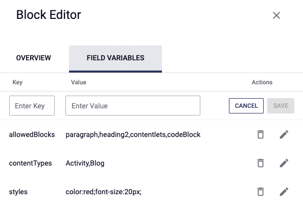
Styling
When defining a Block Editor field inside a Content Type, you can define its CSS styling by way of a field variable. Simply add a field variable with the key styles and set its value equal to a CSS string containing the desired settings, separated by semicolons.
Limiting Available Blocks
It may be useful or necessary in some cases to limit the blocks that a user can add to a given Block Editor Field. For example, typically the h1 tag is occupied by the page or article title, and thus an h1 is not needed on a given blog post.
To limit the available blocks, create a whitelist with the allowedBlocks field variable, which accepts a comma-separated list of block system names, as detailed in the table above — such as heading2,heading3,paragraph.
This option can now also be set through the traditional settings interface in a tab next to field variables, as of version 23.01:
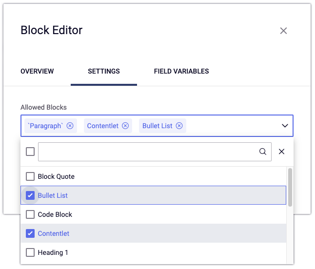
Limiting Available Contentlets
Similar to whitelisting block types, it is possible to limit the Content Types available for insertion into the Block Editor as contentlets. Use the key contentTypes, and set the value to a comma-separated list of Content Type variables — such as, in the above image, Activity,Blog.
The Count Bar and Character Limits
Starting with version 22.12, Block Editors display character counts, word counts, and estimated reading times under the field. This feature comes with two field variables:
displayCountBar, which defaults totruebut can be set tofalseto remove the display, andcharLimit, which takes a numeric value to limit the acceptable length of the content by character count.
charLimit not set | charLimit = 5000 |
|---|---|
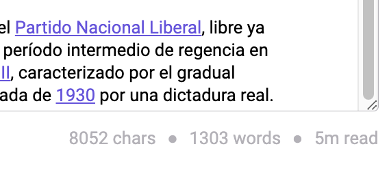 | 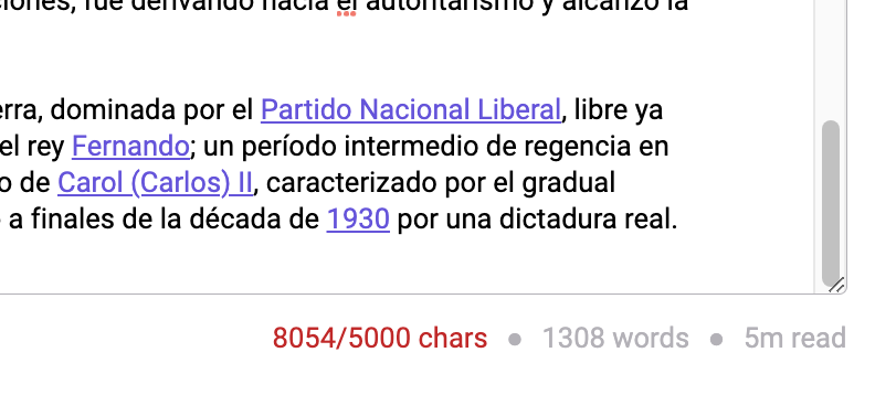 |
Custom Blocks via Remote Extensions
From version 23.03 onward, you can assign a JSON object to the field variable customBlocks to enable remote extensions, described below.
At bare minimum, this object must use the following schema:
{
    "extensions": [{
        "url": "https://this-is-where-you-put-the-compiled-file.js"
    }]
}
However, it can also include an actions property, which takes an array of objects with three further properties:
{
    "extensions": [{
        "url": "https://this-is-where-you-put-the-compiled-file.js",
        "actions": [{
            "command": "commandFunctionName",
            "menuLabel": "Name Displayed in Block Editor",
            "icon": "materialUIIconName"
        }]
    }]
}
By setting this, you can add entire new buttons to the block suggestion menu. For more information, see Remote Extensions.
You can find Material UI Icon names here.
JSON Object
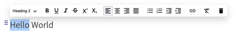
The block content gets saved as a JSON object with all the information you need to render it in your page. For example, say your Block Editor's content consists of a single paragraph containing “Hello World”; its final object would look like this:
{
  "type": "doc",
  "content": [
    {
      "type": "paragraph",
      "content": [
        {
          "type": "text",
          "marks": [
            {
              "type": "bold"
            }
          ],
          "text": "Hello"
        },
        {
          "type": "text",
          "text": " World"
        }
      ]
    }
  ]
}
Each block object has two important properties:
type: a string with the name of the blockcontent: an array of blocks containing the content
The JSON output always begins with a type of doc, which is the parent block. The content property contains all the child-block data — i.e., the content itself.
Within the content blocks, there are further conventions to note, the most important of which is the distinction between text and non-text block types.
The text Type
A content type of text specifies the raw text of the block. For example, a heading, paragraph, or blockquote block will contain content of type text. These members may additionally contain a property named marks, which contain formatting information: bold, italic, underline, etc.
Non-Text Types
Other blocks, such as image or contentlet blocks, will store in their content all the properties necessary to render them. For an image block, this includes its path, width, and height; for a contentlet, it will have all the information about the contentlet field, including the iNode, identifier, etc.
Rendering Content
VTL Rendering
To render a Block Editor field from within a container, call the toHtml() velocity method on the Block Editor's field object:
$dotContentMap.{blockEditorVar}.toHtml('/application/storyblock/')
This will render the content of the field into basic HTML.
For example:
- Paragraphs:
<p>Content</p> - Headings:
<h1>Content</h1><h2>Content</h2><h3>Content</h3>
- List:
<ul><li>Content</li></ul>- Ordered
<ol><li>Content</li></ol> - Unordered
<ul><li>Content</li></ul>
- Ordered
- Horizontal Line:
<hr>
Customizing Block or Contentlet Rendering
dotCMS permits customization of how blocks are rendered as HTML. Simply create a VTL file named for a block you wish to override, and then define the rendering behavior within. These files should live in /application/storyblock, though you may also add further subfolders if more than one set of rendering customizations are needed.
To override the rendering behavior for a contentlet, the VTL file name must begin with dotContent-. For example, in the case of the two Content Types used as examples in the field variables section, you would use files named dotContent-Activity.vtl and dotContent-Blog.vtl.
For a list of valid block names for use in custom VTL definition, see the “System Name” column of the table under Block Types). Additionally, there are two other overridable type names:
| Type | Purpose |
|---|---|
text | Described under The text Type |
hardBreak | Allows the override of line-break behavior |
Finally, call the toHtml() method, passing as an argument the path to the folder containing the overriding file or files.
Customization Example 1: Heading 1
To modify the Heading 1 blocks, first create a file named heading1.vtl inside the /application/storyblock folder.
Add the following code to the file:
#parse( "static/storyblock/render.vtl" )
<h1 class="text-heading">
    #renderContentBlock($item.content)
</h1>
In this code:
- We import the macros.
- We add the HTML
<h1>tag with any class or attributes we need. - Render the text using the
renderContentBlockmacro that will handle formatting marks automatically.
Finally, update your container code to pass the folder with the VTL you created to the toHtml() method like this (replacing blockField with the field's actual variable):
$dotContentMap.blockField.toHtml('/application/storyblock/')
dotCMS will look for VTL files for each block in the storyblock folder and fall back to the default rendering behavior if no custom file is found. If you had used a subfolder within /application/storyblock/, be sure to specify it in the toHtml() function call.
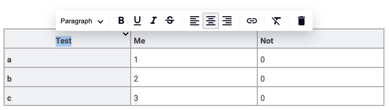
Customization Example 2: Table
To create a custom table block, create a table.vtl file under /application/storyblock/ with the following content:
#parse( "static/storyblock/render.vtl" )

<table class="custom-class">
 #foreach($row in $item.content)
  <tr>
     #foreach($cell in $row.content)
        #if( $cell.type == "tableHeader" )
            <th colspan="$!cell.attrs.colspan" rowspan="$!cell.attrs.rowspan" colwidth="$!cell.attrs.rowspan" >#renderContentBlock($!cell.content)</th>
        #elseif($cell.type == "tableCell" )
            <td colspan="$!cell.attrs.colspan" rowspan="$!cell.attrs.rowspan" colwidth="$!cell.attrs.rowspan">#renderContentBlock($!cell.content)</td>
        #end
     #end
  </tr>
 #end
</table>
As with the Heading 1 example, you'll need to make sure the container controlling the display of the Block Editor contains the necessary .toHtml('/application/storyblock/') method. However, if you've already implemented it, such as through the Heading 1 example, then there's no need to add it a second time.
Customization Example 3: Styling Blocks
Using the tools above, there are a number of ways to manage the styling of blocks. One is to add CSS classes through the custom-block VTLs, as above. An even simpler option is to apply classes via containers.
This can require as little as wrapping the .toHtml() call in a <div> block with a custom class. Using the $dotContentMap built-in content object and assuming the Block Editor field has a variable name of blockField, this might look like the following:
<div class="my-custom-content">
  $dotContentMap.blockField.toHtml('/application/storyblock/')
</div>
Then define styles in CSS based on descendents of the custom class:
.my-custom-content h1 {
    // h1 block styles
}

.my-custom-content h2 {
    // h2 block styles
}

.my-custom-content p {
    // paragraph block styles
}
It is not recommended to add <style></style> tags directly to the rendering VTL files, as this can generate redundant code.
Customization Example 4: Images
Customizing an image within the Block Editor follows a similar pattern: Create a file named dotImage.vtl inside the /application/storyblock folder.
Inside, design your custom rendering scheme, such as the one below:
#parse( "static/storyblock/render.vtl" )
<img class="my-class" src="/dA/${item.attrs.data.identifier}/80q/$!{item.attrs.data.title}/">
And, as in other rendering cases, make sure the Container directs it to the override directory:
$dotContentMap.blockField.toHtml('/application/storyblock/')
Headless Rendering
Headless rendering of the Block Editor begins with an API call to fetch the JSON object. This call may be made via a variety of APIs, including the Page API, GraphQL, Content API, Elasticsearch API, or any other API capable of calling a contentlet containing a Block Editor field.
For example, a Page API call would be a straightforward retrieval using this address template:
https://{server_address}/api/v1/page/json/{page_path}
Below is a demo page and its corresponding Page API path. Please note that the Page API requires being signed in (user:admin@dotcms.com, password:admin):
…/blog/post/french-polynesia-everything-you-need-to-know …/api/v1/page/json/blog/post/french-polynesia-everything-you-need-to-know
On the linked page's output, the blogContent field begins as all Block Editor JSON objects do: with "type": "doc". Its second member, content, contains a nested array of all the child blocks — i.e., everything entered in the Block Editor.
Once the JSON object is parsed, your options for rendering are virtually limitless. Grab a Javascript framework of your choice and get creative!
Here's one compact example of rendering blocks using React.
Remote Extensions
dotcms 23.03 introduces the ability to create custom extensions for the Block Editor, which can take the form of fully custom blocks within the suggestion menu.
This process requires some Javascript and the use of a dotCMS-supplied repository to create the development environment and facilitate compiling the final output JS file.
To enable the extension, the compiled output file must be referenced in the url property of a JSON object assigned to the customBlocks field variable.
The development repo includes an extensive how-to guide in its readme file. For more information, you can also watch a video on producing custom extensions:
Get started with remote extensions here!
Embedded Contentlet Behavior
As noted above, contentlets of other Content Types can be embedded for display within a Block Editor. Through field variables, you can limit which Content Types it will accept, and through custom VTL files you can control how they will render within the field.
In versions prior to 22.10, contentlets in a Block Editor are stored as copies in the field's JSON data; if the original contentlet undergoes changes, the version stored in the Block Editor will not automatically update, and requires manual re-insertion to remain up to date.
In current versions, Block Editor contentlets remain automatically up to date with their originals, syncing up with both the database and the cache. It should be noted that this operation carries a slight performance cost — in most cases statistically insignificant. Nevertheless, this cost can be offset by disabling the cache synchronization by setting the following environment variable:
DOT_REFRESH_BLOCK_EDITOR_REFERENCES=false
Database synchronization remains, even if cache synchronization is disabled.
Finally, as of version 23.07, it is no longer possible to embed a contentlet within its own Block Editor — an action that could lead to unrecoverable errors.
As of version 24.06.17, you can click through to edit embedded contentlets. Clicking the embedded contentlet displays an “edit” pencil icon beside the “delete” trashcan icon. Clicking the former allows you to switch over to directly edit the embedded contentlet, with the option to return to the parent contentlet.

Converting WYSIWYG Fields
It is additionally possible to transform WYSIWYG fields into Block Editor fields within a given Content Type. For more information, see Converting WYSIWYG to Block Editor.