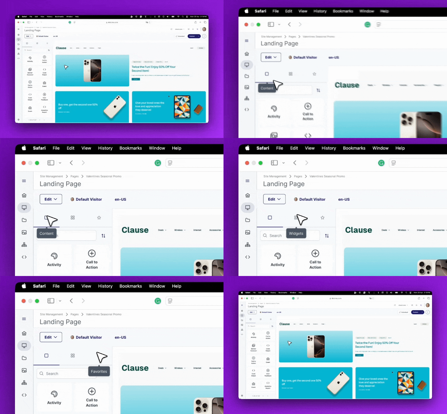
At dotCMS, we want to help content authors stay focused on what matters: creating great experiences. The Universal Visual Editor (UVE) plays a huge role in that, making it simple to edit complex, dynamic pages.
There was one part of that experience that needed a rethink: the Content Palette.
The problem we needed to solve
As sites scale, so does the number of content types and elements authors rely on every day. The original palette surfaced everything in a single scrollable list, which introduced two major challenges:
Confusion for authors
With hundreds of items collapsed into a single list, finding the right content type became a task in itself. Authors had to sift, scroll, and repeat. That slowed down page building and increased cognitive load.
Performance limitations for large sites
Some of our customers have 700+ content types. The old implementation fetched everything at once, generating heavy payloads that could stall or even crash the server.
A smarter, more intuitive design
To fix both the usability and technical issues, we re-designed the palette from the ground up. The new experience is:
Organized, not overwhelming
The palette now has three distinct tabs, so authors can find what they need with less scrolling:
Content
Widgets
Favorites

Separating Content from Widgets removes the guesswork from the building process. Authors immediately know where to go based on what they want to add. This intuitive division improves clarity and speeds up decision-making. On top of that, the new Favorites tab gives users a personalized space for their most used elements.
Sorting and viewing options that match author preferences
Different users organize information differently, so we added:
Sorting: Most Popular, A→Z, and Z→A
View modes: a Grid view for visual scanning and a List view for quick precision
Authors now control how they browse, instead of being forced into a single layout.
Built for large and complex sites
A paginator now loads items in manageable chunks instead of pulling everything at once. Combined with the new dynamic backend endpoint, performance remains smooth even at enterprise scale.
Favorites: A Personal Workspace for Faster Builds
The new Favorites tab gives authors instant access to the content types and widgets they rely on the most. Instead of searching through a long list every time, users can pin their frequently used items and keep them only a click away. This creates a personal workspace inside the palette that helps authors build pages faster, reduces repetitive searching, and keeps their focus on creating instead of hunting for the right element.
A better experience through a better mental model
We also rethought placement. dotCMS already has a right-side panel planned that changes contextually based on the selected item and provides editing actions. The palette has a different purpose. Its content never changes; it’s always the source for drag-and-drop elements.
To reinforce that difference, we moved the palette to the left side, adjacent to the UVE canvas. This spatial separation makes the experience easier to understand:
Right side: modify selected item
Left side: build and add new items
It’s a subtle, but essential shift that supports how authors think while working.
The result: an authoring experience that scales
This refactor delivers:
Faster builds with less searching
Less overhead for authors
Performance that stays reliable as sites grow
A UI that supports the mental model of building vs. editing
This is another step toward making the UVE the most intuitive and powerful enterprise authoring tool available. We’re excited for customers to try it and continue helping us evolve the experience.